Echoes in Amber: Understanding the Bias of Photographic Materials and their Influence on Color
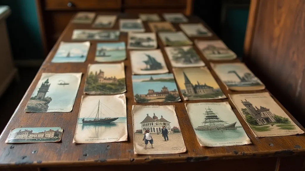
There’s a peculiar magic to holding an antique postcard. It's more than just paper and ink; it's a tiny, fragile window into a vanished world. I remember finding my first collection at a dusty antique shop as a child. The brittle cardstock, the faded imagery, the cryptic handwritten messages on the reverse – it sparked a lifelong fascination. Now, as a colorization artist, my work is deeply rooted in understanding not just what *was*, but how the photographic materials of that time *shaped* what we perceive as reality.
The simple act of adding color to a black and white image—postcard colorization—isn’t merely about applying hues; it’s an act of historical interpretation. And that interpretation is profoundly influenced by the inherent biases baked into the photographic process itself.
The Chemistry of Memory: Early Photographic Processes
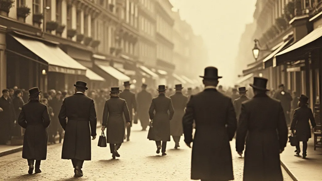
Before digital sensors and color film, photographic images were born from complex chemical reactions. The earliest processes, like albumen printing and cyanotype, produced images with distinctive characteristics – not just in their tonality, but also in the way they rendered color. Let's consider albumen prints, incredibly popular in the late 19th century. They were made by coating paper with egg white (albumen), which acted as a binder for light-sensitive silver salts. The resulting print, while incredibly detailed, had a characteristic warm, yellowish tone. This wasn’t necessarily a reflection of the scene's actual color; it was a consequence of the materials used. Even the type of paper – its acidity, its texture – played a role in the final look.

Cyanotypes, often called blueprints, were another popular process, especially for reproducing architectural drawings. They produced images in a distinctive blue hue, derived from iron salts. While stunning in their own right, their inherent blueness obviously distorted any attempt to represent the true colors of the scene being captured.
As photographic technology evolved, processes like gum printing and platinum printing emerged, each bringing its own set of biases. Gum prints, known for their painterly quality, often had a reddish-brown cast. Platinum prints, prized for their archival qualities, had a cooler, more silvery appearance.
Beyond the Chemistry: The Human Element
The biases weren't confined to the chemicals. The photographer’s choices – the angle of the shot, the lighting conditions, even the lens used – all contributed to the final image. Early lenses were often imperfect, introducing distortions and aberrations that affected the perceived colors. And of course, the photographer's artistic interpretation played a crucial role. Were they striving for realism, or were they embracing a more impressionistic style? Their choices, influenced by prevailing artistic trends and personal preferences, shaped the final look of the image.
Think about the fashion photography of the early 20th century. The reliance on hand-tinting – a process where artists would manually apply color to black and white prints – introduced another layer of subjectivity. The colorist’s choices, influenced by fashion trends and popular tastes, often bore little relation to the actual colors of the clothing or environment being depicted.
The Colorization Artist’s Challenge: Honoring the Past, Reimagining the Present
As a colorization artist, my goal isn’t to create a perfect replica of what the scene *actually* looked like. That’s an impossible task. Instead, I strive to create an image that is both faithful to the spirit of the original and visually compelling in its own right. I spend countless hours researching the historical context – the clothing styles, the architecture, the plant life – to ensure that my color choices are as accurate as possible. But I also allow myself a degree of artistic license, guided by my own sense of aesthetics.
It’s a delicate balancing act. Too much color, and the image loses its historical authenticity. Too little, and it feels flat and lifeless. Understanding the biases of the original photographic process is essential to achieving that balance. For example, knowing that albumen prints often had a yellowish tint, I might deliberately avoid adding too much yellow to my colorization, to counteract that bias. I might also study the typical color palettes used by hand-colorists of the period, to inform my own choices.

One of the most rewarding aspects of postcard colorization is the opportunity to breathe new life into these forgotten snapshots of the past. To see the faces of people who lived a century ago, once frozen in monochrome, now bathed in the warm glow of color—it’s a truly moving experience. And it’s a reminder that even though photographic materials may have their inherent biases, they also hold the power to connect us to our shared history.
Collecting and Appreciating: A Deeper Understanding
For those interested in collecting antique postcards, understanding these processes can add another layer of appreciation. A cyanotype postcard, with its characteristic blue hue, isn’s simply a different looking image; it’s a testament to the technology of the time. Knowing the “look” that came naturally from a particular printing process allows collectors to better identify and value these treasures. Similarly, being aware of hand-tinting styles can help to differentiate between authentic vintage postcards and later reproductions.
The artistry isn't confined to the photographer or colorist. Think of the engravers and printers who created the intricate details in the original images. The craftsmanship involved in these early photographic processes was remarkable, often requiring days or even weeks of painstaking labor. These weren’t disposable images; they were cherished keepsakes, often passed down through generations.

Ultimately, postcard colorization is more than just a technical skill; it’s an act of historical empathy. It’s about understanding the challenges and limitations of early photographic technology, and about honoring the artistry and craftsmanship that went into creating these remarkable images. It's about revealing the echoes in amber, the faint traces of a lost world, and bringing them back to life in vibrant color.


