The Spectrum's Embrace: Finding Inspiration in Unexpected Color Combinations
The scent of aged paper, the faint imprint of a long-ago stamp, the delicate, almost fragile nature of an antique postcard – these are the sensory hallmarks that draw us to these tangible echoes of the past. They are not merely historical documents; they are windows into lives lived, moments captured, and stories waiting to be rediscovered. And within the monochromatic landscape of the original black and white image lies a profound potential, a silent invitation to breathe vibrant life back into these fragments of time through the art of postcard colorization.
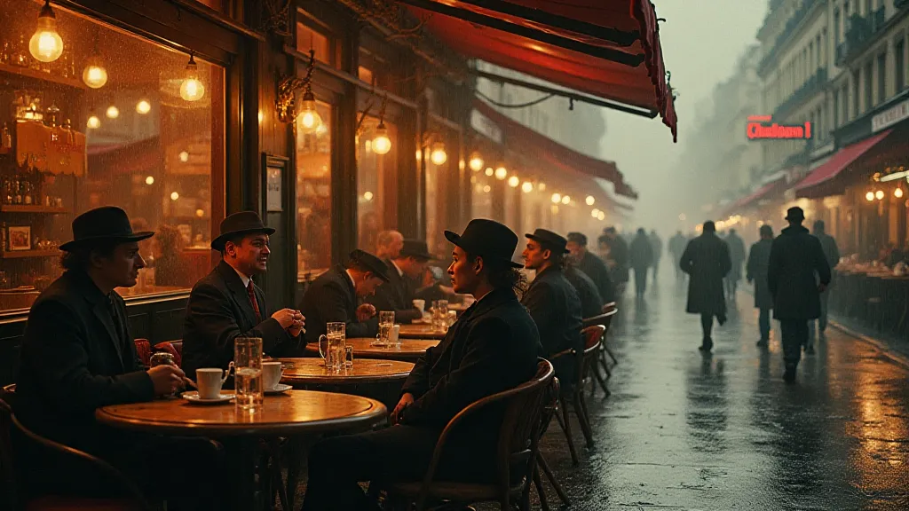
My own journey into this fascinating craft began with a postcard depicting a bustling street scene in Vienna, circa 1910. The stark contrast of light and shadow, while evocative, felt incomplete. It lacked a certain… warmth. I found myself compelled not just to recreate the scene, but to interpret it, to infuse it with the *feeling* of Vienna as I imagined it - the warmth of the coffee houses, the richness of the music, the vibrancy of the culture. That’s when I realized that accurate colorization wasn’t the sole goal; artistic interpretation, informed by historical understanding, was equally vital.
Beyond Literal Reproduction: The Power of Artistic License
The temptation, especially when starting, is to strive for perfect accuracy. To meticulously research the exact shade of a building’s facade, the precise hue of a gentleman’s hat. And while that research is crucial—knowing what *could* have been is essential—being rigidly bound to that knowledge can stifle creativity and diminish the emotional impact of the final image. What truly resonates with viewers isn't a perfectly replicated past, but a compelling narrative, a feeling of connection to the people and places depicted.
Consider the subtle role color plays in shaping our perception of emotion. A drab, realistic grey for a factory might convey a sense of bleakness and hardship, appropriate if the intention is to highlight the social conditions of the time. But a warm, amber glow could evoke nostalgia, suggesting a simpler, more hopeful era. A faded crimson for a woman’s dress could whisper of forgotten romance, while a vibrant turquoise might hint at a spirit of adventure. The possibilities are endless.
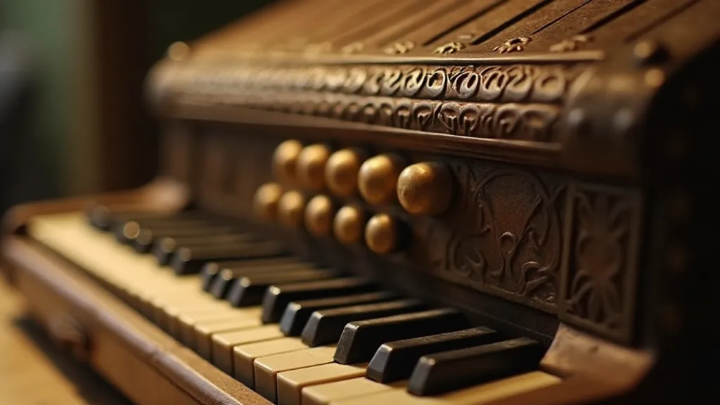
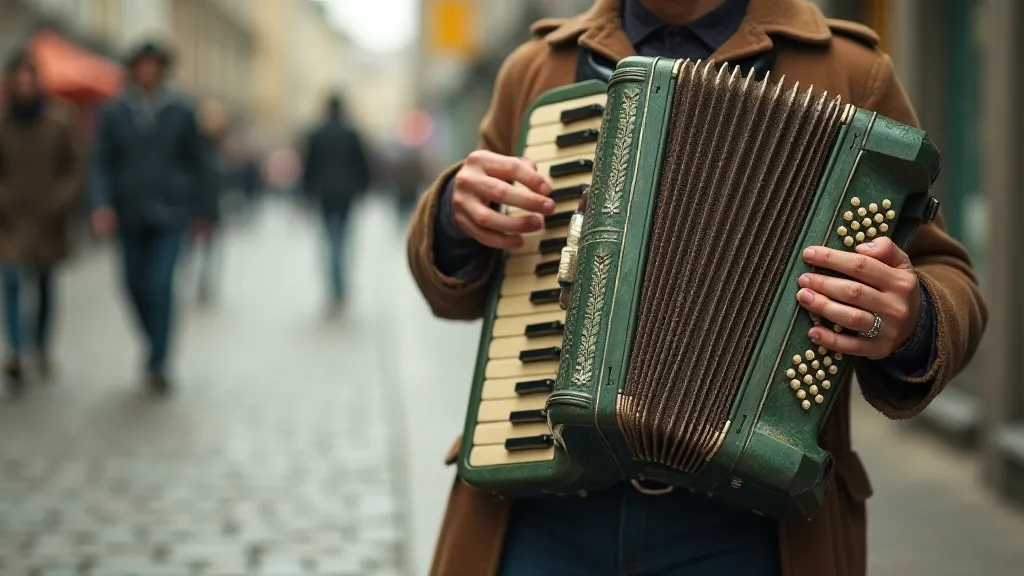
The Accordion's Song: A Study in Unexpected Harmony
To illustrate this, let’s imagine colorizing a postcard featuring a street musician playing an accordion. The accordion itself, with its bellows and keys, is a powerful symbol – a vessel for music, emotion, and cultural expression. A straightforward approach might render the accordion in a neutral beige or brown. Perfectly plausible, certainly. But what if we chose a surprising color – a deep, mossy green, reminiscent of the forests where many of the accordion's components originally came from? The unexpected hue adds an element of mystery, a subtle layer of complexity that elevates the image beyond a simple representation.
Think about the other elements of the scene. The cobblestone street could be rendered in a muted lavender, recalling the dyes historically used to color them. The musician’s clothing could feature a splash of unexpected coral, hinting at a touch of personality and flair. These are not arbitrary choices; they are informed decisions designed to enhance the storytelling potential of the image. They are subtle cues that guide the viewer’s eye and shape their emotional response.
The accordion, in its own way, is a lesson in unexpected harmony. It’s a complex instrument, born from the union of seemingly disparate materials – wood, metal, leather. Yet, when played, it produces a beautiful, resonant sound. Similarly, in postcard colorization, the blending of unexpected colors can create a visual harmony that transcends the limitations of the original black and white image.
Historical Context: A Foundation for Creative Interpretation
Informed artistic license isn's about abandoning historical accuracy; it’s about building upon it. A deep understanding of the era depicted is paramount. Researching the prevailing fashion trends, the popular color palettes, the typical architectural styles – all of this provides a framework within which to experiment with color. Knowing that Prussian blue was a fashionable color for clothing in the early 1900s, for instance, allows you to incorporate it into your colorization with confidence. Understanding the limited availability of certain dyes during a particular period provides context for the color choices that were most likely to have been made.
Beyond the purely visual aspects, consider the social and cultural context. Was the scene depicting a period of prosperity or hardship? Were the people portrayed optimistic or apprehensive? These underlying currents can subtly influence your color choices, adding depth and nuance to the final image. For instance, a postcard showing a group of workers during the Industrial Revolution might benefit from a palette dominated by muted tones, punctuated by flashes of vibrant color that represent the hope for a better future.
Color Theory for Artists: A Subtle Guide
While artistic intuition plays a crucial role, a basic understanding of color theory can significantly enhance your postcard colorization skills. Consider the principles of complementary colors – hues that sit opposite each other on the color wheel and create a vibrant contrast when placed together. A touch of orange can enliven a scene dominated by blue; a splash of yellow can brighten a palette of greens.
Similarly, understanding the concept of analogous colors – hues that sit next to each other on the color wheel – can help you create a sense of harmony and cohesion. A progression of blues and greens can evoke a feeling of tranquility, while a sequence of reds, oranges, and yellows can create a sense of excitement and energy. These subtle shifts in color can have a profound impact on the overall emotional impact of the image.
The Legacy of a Faded Memory
The art of postcard colorization is more than just a technical exercise; it’s a form of preservation, a way of breathing new life into fragments of history. It's a conversation with the past, a chance to reimagine a moment in time and share it with a new generation. By embracing artistic license, informed by historical understanding and guided by the principles of color theory, we can transform faded black and white images into vibrant, emotionally resonant works of art that capture the essence of a bygone era.
And sometimes, that means finding beauty in the unexpected, harmony in the discordant, and a spectrum of possibilities within the embrace of color. Let’s remember the accordion, a complex instrument creating beautiful sound through unexpected blends. Let's do the same with our art.