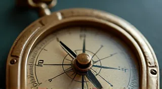
The Archivist's Compass: Navigating the Labyrinth of Primary Source Color Research
There’s a quiet power that hums from an antique postcard. Not just the power of a tangible link to the past, but a muted promise—the ghost of color waiting to be resurrected. As an artist specializing in postcard colorization, I'm not simply adding hues; I'm attempting a conversation with history, piecing together a lost visual narrative. The most rewarding, and arguably the most challenging, part of this process is the research – specifically, the hunt for what I call “primary source color palettes.” These aren't guesses or modern interpretations; they are echoes of the colors actually present at the time the photograph was taken.
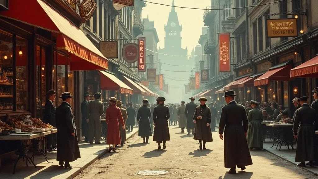
It’s easy to fall into the trap of relying on intuition or what "feels right." While artistic license has its place, true postcard colorization – the kind that evokes a sense of authenticity and transports the viewer – demands rigor. It requires becoming, in a sense, a historical detective, following a trail of faded evidence to uncover the chromatic fingerprint of a bygone era. Imagine holding a photograph of a bustling city street in 1910, a moment frozen in grayscale. How did the shop signs truly look? What shade of red adorned the delivery carts? What colors defined the fashion of the day?
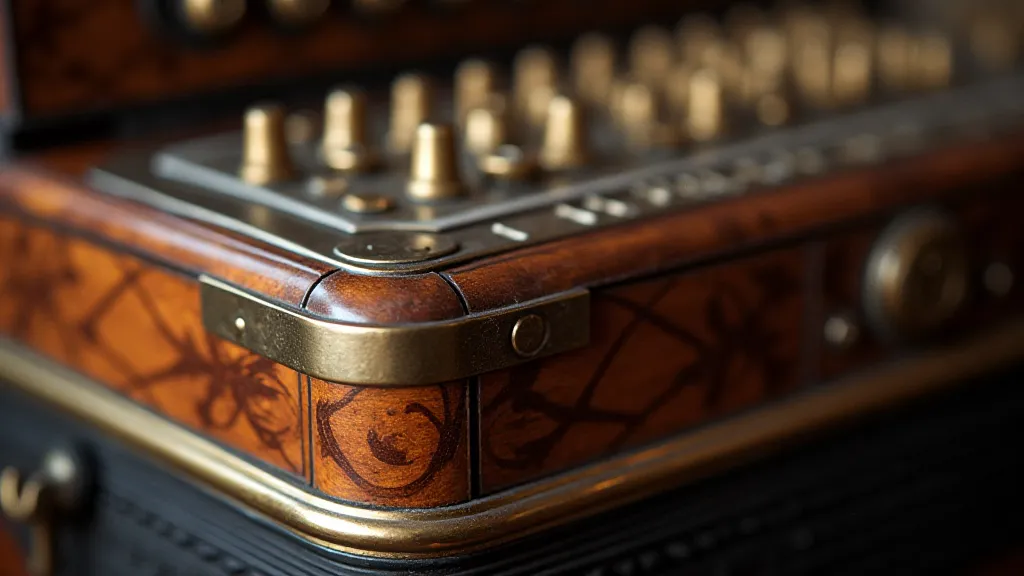
The journey began for me, quite unexpectedly, with a fascination for antique accordions. My grandfather, a quiet man of immense skill, played one. The instrument itself—gleaming with polished wood, vibrant bellows, and intricately crafted buttons—held a story. I noticed how even in sepia-toned family photos, you could almost *feel* the richness of the wood, the boldness of the trim. It sparked a desire to see those colors restored, not as an act of fantasy, but as an act of remembrance.
The Landscape of Primary Sources
So where does one begin this chromatic quest? The answer, thankfully, isn't found in a single, convenient location. It’s a scattered treasure hunt requiring a multi-faceted approach. Contemporary advertising materials are a goldmine. Think about it: businesses desperately wanted to attract attention. That meant using bold, eye-catching colors in their signage, packaging, and promotional materials. Old trade catalogs, often digitized and available online, are a fantastic resource. Imagine finding an advertisement for a bakery from 1905, showcasing a display of pastries in vibrant shades of pink, yellow, and cream. Suddenly, that grayscale photograph of the bakery on Main Street gains a new dimension.
Illustrations are another crucial piece of the puzzle. Period magazines and newspapers frequently featured illustrations depicting scenes of daily life, fashion, and architecture. While these aren't photographic records, they offer valuable clues about popular color choices. Be mindful of artistic license, of course. An illustrator might exaggerate colors for dramatic effect, but they still provide a general sense of the palette in use.
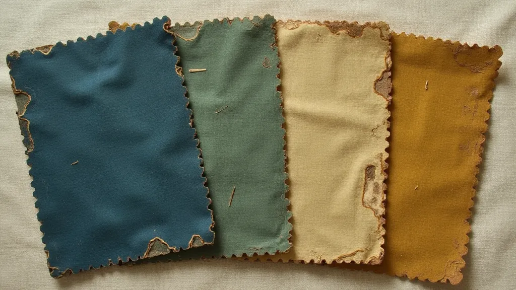
Textiles are often overlooked, but they represent another invaluable source of primary color information. Clothing, upholstery, curtains – these all possessed colors that would have been visible in the original photograph. Museums often hold collections of historical textiles, and online archives can provide images or descriptions of fabrics used during specific periods. Consider the impact of a deep indigo dye versus a more faded blue—the nuances matter.
The Challenges of Interpretation
The process isn’t without its complications. Faded inks, degraded paper, and the inherent subjectivity of memory all present challenges. What might have appeared as a vibrant crimson in 1910 could now appear as a dull brownish-red. The color perception of the photographer, the limitations of the photographic process itself, and even the ambient lighting conditions all influenced the final image. A photographer might have deliberately chosen a monochrome filter, emphasizing certain tones while minimizing others.
Furthermore, regional variations in color usage must be considered. A city known for its industrial prowess might have a palette dominated by grays and browns, while a coastal resort town might be awash in brighter, more playful hues. Even the quality of the pigments used varied significantly over time. Early synthetic dyes were often less stable and prone to fading, leading to unexpected shifts in color over the decades.
Beyond the Palette: Context and Craftsmanship
My most rewarding colorization projects aren't simply about matching colors; they're about understanding the craftsmanship and the spirit of the era. When restoring a postcard depicting a blacksmith’s shop, I researched the types of coal used to fuel the forge, the materials used to construct the tools, and even the uniforms worn by the blacksmith and his apprentices. The more I understand about the subject matter, the more accurately I can recreate the visual world.
This meticulous approach extends to the technical aspects of digital photo restoration. I utilize a variety of photo manipulation techniques, including layer masking, color grading, and noise reduction, to achieve a realistic and aesthetically pleasing result. However, I’m always mindful of preserving the integrity of the original photograph. The goal isn't to create a hyper-realistic image, but to evoke a sense of authenticity and transport the viewer back in time.
A Deeper Resonance
The act of bringing color back to these silent witnesses of history is profoundly moving. It's a way of honoring the lives of those who came before us, of reminding ourselves of the richness and complexity of the past. It’s a dialogue between the present and a bygone era, facilitated by the careful application of artistic skill and historical understanding. Every restored postcard isn't just an image; it's a window into a world that deserves to be remembered.
The journey of the archivist’s compass—navigating the labyrinth of primary source color research—is ongoing. With each project, I learn more about the intricacies of history, the beauty of craftsmanship, and the power of color to evoke emotion and memory. And, like my grandfather’s accordion, these restored postcards resonate with a quiet, enduring power, connecting us to the stories of those who came before.