Resurrecting Shadow: Techniques for Recreating Lost Shadows & Lighting in Colorized Images
There's a quiet magic in holding an antique postcard. It's more than just cardboard and ink; it’s a portal. A fleeting glimpse into a time long past, a snapshot of lives lived, events witnessed, and places that might now be irrevocably changed. These fragile remnants of history often arrive in shades of grey, their stories whispered in monochrome. My journey into postcard colorization began not with a technical curiosity, but with a deep, almost visceral, connection to these glimpses of the past – a longing to breathe life back into them, to see them as they might have been perceived by those who lived within their scenes.
The process of colorizing is often perceived as simply "adding color." While that’s technically true, it's a gross oversimplification. Truly successful colorization goes far beyond merely applying hues. It's about understanding light, shadow, and their intricate dance across surfaces. It’s about reconstructing a lost reality, informed by historical research and a keen eye for detail. And the most critical, and often overlooked, aspect of this reconstruction is the faithful recreation of shadows and lighting conditions.
The Vanishing Act of Light
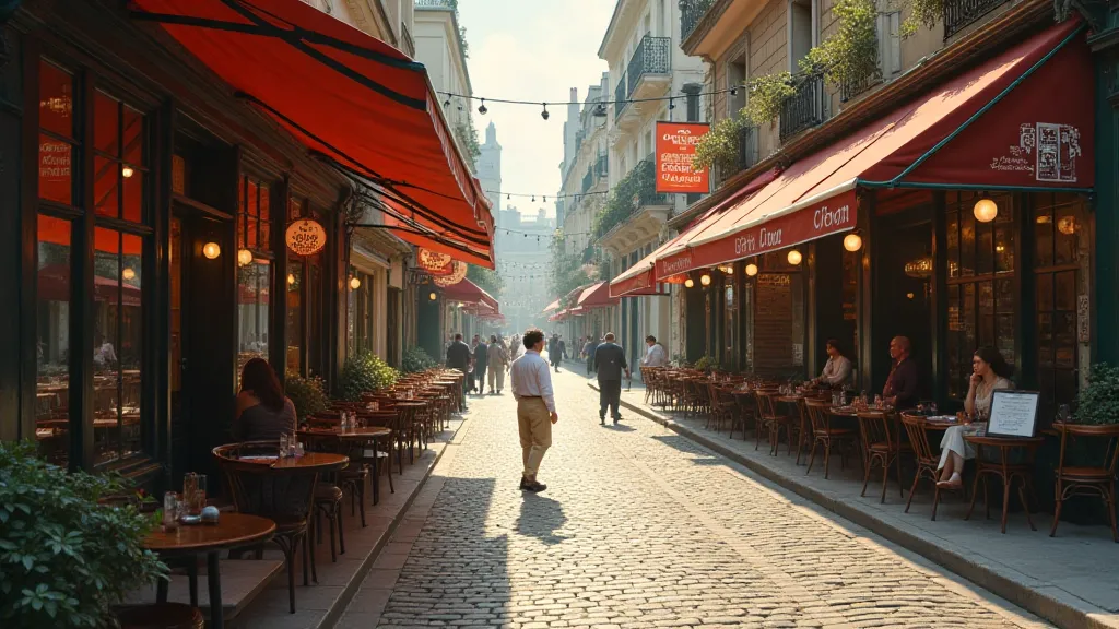
Consider a black and white photograph: it doesn't inherently convey the *source* of light. We see tonal variation – highlights and shadows – but the direction, intensity, and color temperature of the original light source are entirely absent. This is information we, as colorizers, must deduce and recreate. Think about a photograph of a bustling marketplace in 1910. Sunlight might be streaming from a particular direction, casting long shadows from the stalls and the vendors’ carts. Without understanding this, the colorized image will feel flat, artificial, and ultimately, disconnected from its historical context.
My grandfather was a carpenter, a man of incredible skill and attention to detail. He taught me about the importance of understanding how light interacts with wood - how it reveals the grain, how it highlights imperfections, and how it shapes our perception of its texture. That understanding translates directly to colorization; each surface – brick, wood, fabric, skin – reacts to light in a unique way, and accurately recreating those responses is paramount.
Reconstructing the Scene: A Layered Approach
My approach to recreating lighting conditions in colorized images is layered. First, I analyze the original black and white image. I study the contrast – where are the darkest shadows, where are the brightest highlights? I try to imagine the probable light source. Was it direct sunlight, or diffused light from an overcast sky? What time of day was it likely taken?
Next, I begin the colorization process, but instead of focusing solely on the colors themselves, I pay equal attention to the shadows. I don't just apply black or dark grey; I use a range of tones and colors to mimic the effects of real-world lighting. For example, shadows cast by buildings on a sunny day might have a slightly bluish tint due to atmospheric perspective. Shadows under trees might be cooler and more greenish.
The use of adjustment layers in digital painting software is crucial here. Using curves and levels adjustments, I can fine-tune the contrast and tonal range of the shadows, ensuring they feel natural and convincing. Selective color adjustments also allow me to subtly tint the shadows, adding depth and realism.
The Subtle Art of Atmospheric Perspective
Another vital element in recreating accurate lighting is understanding atmospheric perspective. Objects that are further away appear less contrasty and have a slightly bluish or greyish tint due to the scattering of light in the atmosphere. This effect is often lost in black and white photographs, and its reintroduction in colorization can dramatically enhance the sense of depth and realism. It's a subtle detail, easily overlooked, but its impact is profound.
I remember assisting my grandfather restoring an old wooden rocking chair. He explained how the varnish subtly shifts the way light reflects off the wood, creating a richer, more complex visual experience. That lesson stuck with me. In colorization, replicating these subtle shifts in reflectivity is key to creating an image that feels truly authentic.
Color Theory and Historical Accuracy
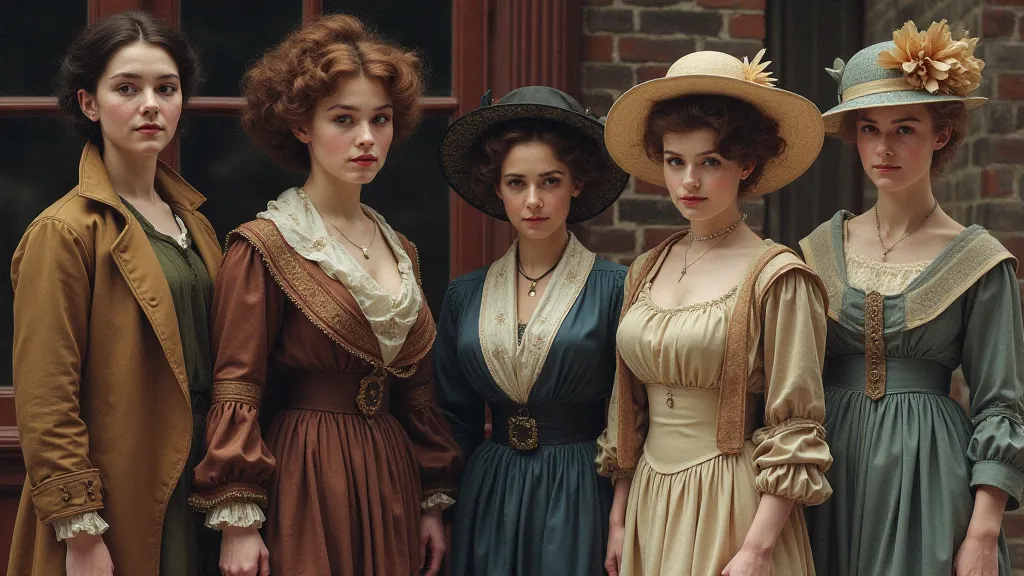
While a strong grasp of color theory is essential for any colorizer, it’s equally important to consider historical accuracy. The colors available during the early 20th century were different than they are today. Pigments and dyes had different properties, and their application techniques varied. Researching the clothing, architecture, and objects depicted in the postcard is crucial for ensuring that the colorized image feels historically accurate.
Beyond the Technical: A Sense of Empathy
Ultimately, successful postcard colorization isn't just about technical skill; it's about empathy. It’s about trying to understand the lives of the people who were captured in the original photograph, and about recreating a world that feels both authentic and evocative. It's about breathing life back into a lost moment in time, and sharing it with others.
There’s a quiet satisfaction in knowing that I’m contributing to the preservation of history, one colorized postcard at a time. I'm not just adding color; I’m resurrecting shadows, recreating light, and sharing a glimpse of the past with a new generation. And in doing so, I'm honoring the memory of those who came before us – the people who lived, loved, and left their mark on the world.