Chromatic Whispers: Adding Subtlety and Nuance to Historical Colorization
There's a profound beauty in holding an antique postcard. The cardstock, often brittle with age, the faded ink of the address, the delicate, monochromatic image – they whisper stories of a bygone era. These aren’t just pieces of paper; they are time capsules, glimpses into the lives of people we’ll never know. To colorize these treasures is a delicate undertaking, a responsibility to preserve not just the visual, but the emotional truth of the scene.
For years, I was drawn to the vibrancy of color. The bolder the hues, the more immediate the impact, I believed. My early attempts at colorizing postcards reflected this. Bright reds, intensely saturated blues – I chased after a sense of spectacle. But the results felt…wrong. They lacked the quiet dignity, the inherent melancholic charm that defines these historical documents. The color felt imposed, artificial, a distraction from the story the postcard was trying to tell. It was only through years of practice, and a growing appreciation for nuance, that I began to understand the true art of historical colorization.
The problem, I realized, wasn’t the color itself, but the *approach* to it. It's tempting to think of colorization as a chance to “fix” or “improve” upon the original image. To correct perceived imperfections or to simply inject a sense of excitement. But that's not the goal. The goal is to reveal what was likely present, to add a layer of understanding, not to reinvent the past. And that requires a deep respect for the original intent and the historical context.
Understanding the Historical Palette
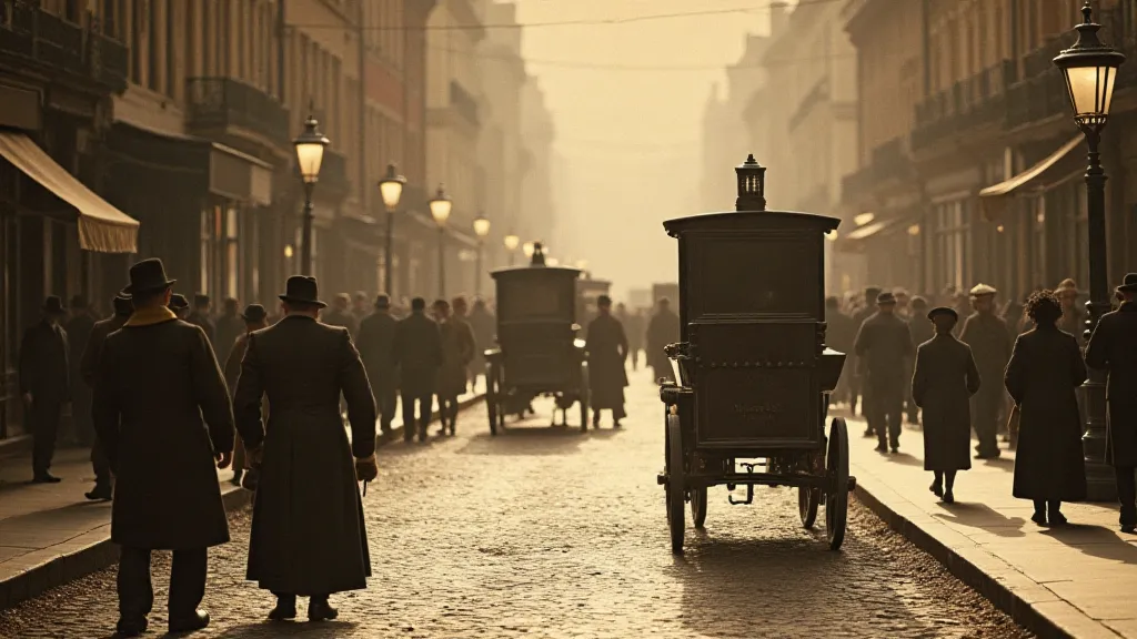
One of the most crucial aspects of believable historical colorization is understanding the limited palette available at the time. Today, we have an almost limitless range of colors at our fingertips, thanks to digital tools. But in the early 20th century (and earlier), pigments were less readily available and more expensive. Colors were often muted and earth-toned. Vivid hues were considered luxuries, reserved for special occasions or higher-end products.
Researching the specific era and location depicted in the postcard is vital. What were the common colors used in clothing? What were the prevalent building materials? What kind of vegetation would have been present? These seemingly small details add up to a much more accurate and convincing final product. For example, a postcard depicting a rural farming community in the 1920s wouldn’t be saturated with neon greens; it would likely feature muted shades of olive, sage, and moss.
The Art of Subtlety: Avoiding Oversaturation
The biggest pitfall for many aspiring colorizers is oversaturation. It’s easy to be seduced by the vibrancy of color and to push the hues too far. But this often results in an image that looks jarring and unrealistic. Imagine a postcard of a family gathering, all dressed in garish, unnatural colors. It would immediately shatter the sense of authenticity and believability.
Instead, aim for subtlety. Start with muted tones and gradually build the color. Use a light touch and be willing to experiment. Often, less is more. A subtle blush on a woman's cheeks, a gentle hint of green in the foliage, a slightly warmer tone to the brickwork – these seemingly minor adjustments can have a profound impact on the overall effect.
Think of it like watercolor painting. The most beautiful watercolors often rely on the interplay of light and shadow, with subtle gradations of color blending seamlessly together. The same principle applies to historical colorization. It's about creating a believable atmosphere, not a spectacle.
Craftsmanship and Attention to Detail
Beyond color, the entire process of digital photo restoration and manipulation requires a keen eye for detail. Shadows need to be carefully adjusted to match the lighting conditions. Skin tones should be realistic and believable. Textures need to be preserved and enhanced. It’s a painstaking process that demands patience and precision.
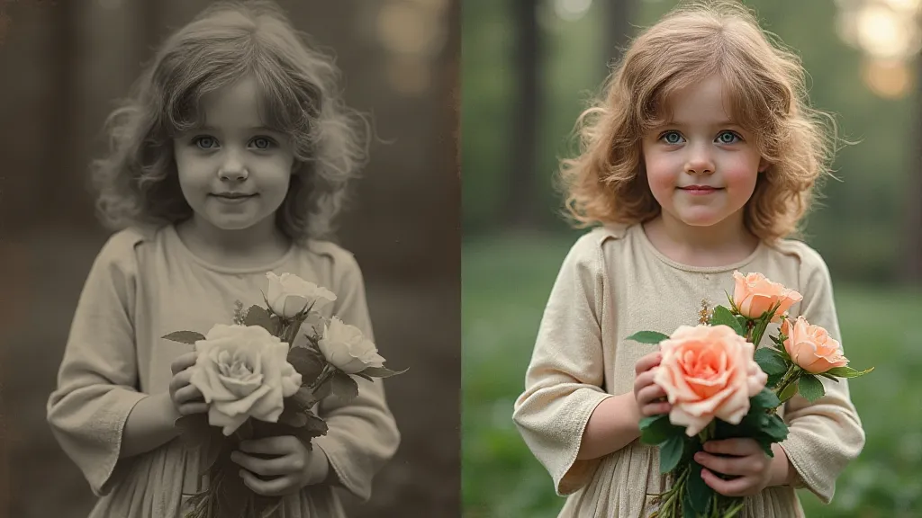
I remember meticulously colorizing a postcard of a young girl holding a bouquet of flowers. It took hours to get the color of the flowers just right, to ensure that they looked both natural and harmonious with the rest of the image. I had to constantly refer to photographs and paintings from the same era to ensure accuracy. The smallest adjustment - a slightly different hue, a minor shift in tone – could make a significant difference in the final result.
The Emotional Resonance of Preserving the Past
For me, the real reward of historical colorization isn’t just the technical accomplishment, but the emotional connection it creates. To breathe new life into these faded memories, to bring a fleeting moment in time back into focus – it's a privilege. It’s about honoring the past, preserving a piece of history, and sharing it with others.
There's something deeply moving about seeing the faces of people who lived so long ago, to imagine their lives, their hopes, and their dreams. These postcards aren't just images; they’re windows into the souls of people who came before us.
Beyond the Technical: Appreciating the Collection
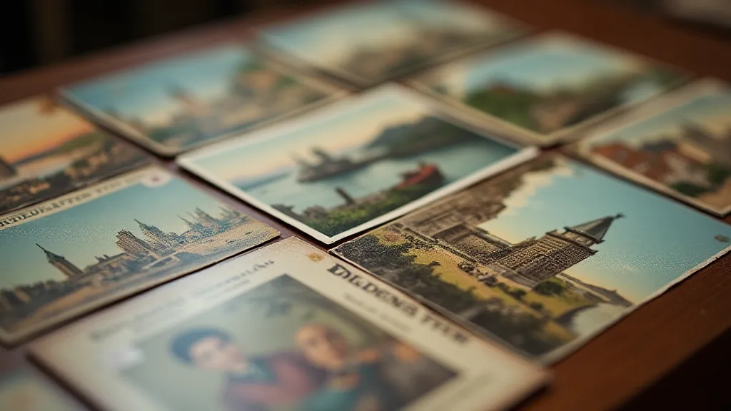
Colorization can be a gateway to a deeper appreciation for antique postcards themselves. Many collectors focus on the photographic process, the printing techniques, or the subject matter. Understanding the nuances of these aspects adds another layer of richness to the hobby. Knowing, for example, that a postcard was printed using a specific lithographic process, or that the photographer was known for a particular style, can significantly enhance its value and historical significance. The subtle imperfections - a slight printing error, a faint crease - are often testaments to the craftsmanship of the era, adding to their charm and character.
Ultimately, historical colorization is about more than just adding color; it's about understanding, respecting, and celebrating the past. It's about adding a subtle whisper of life to these fragile echoes of a bygone era, allowing us to connect with them on a deeper, more emotional level. And the beauty of that connection lies in the quiet, understated moments.