Beyond the Sepia Veil: Unearthing the True Tones of a Bygone Era
There’s a quiet magic held within an antique postcard. A frozen moment in time, a glimpse into a world we can only imagine. We pore over the faded imagery, the delicate edges, the handwritten messages on the back, yearning to connect with the lives of those who sent and received them. But what if the familiar sepia tones, the ingrained perception of a muted past, are actually a veil, obscuring the vibrant reality that once existed? At The Antique Postcard Colorization Studio, we’re driven by a passion to gently lift that veil, to bring a new layer of understanding and appreciation to these treasured artifacts.
My own fascination began with my grandfather. He was a meticulous collector of postcards, amassed over decades of travel and correspondence. He wasn’t interested in the novelty; he sought out the stories they held. I remember sitting with him, leafing through albums overflowing with images – bustling cityscapes, tranquil rural scenes, portraits of people we would never know. Almost all of them were sepia. It felt, inherently, *right* that they should be that way. It was the color of history, wasn’t it? It took years, and a growing interest in digital art and photo manipulation, to understand that sepia isn't a representation of the original color, but a consequence of time.
The Fading Palette: Why Sepia Isn’t Always Truth
The prevalence of sepia isn't some intentional artistic choice from the photographers of the early 20th century intending to evoke nostalgia; it’s a natural process. Black and white photography was, initially, a very expensive and complicated process. Early photographic papers were not lightfast; they were made from unstable chemicals. The silver particles would oxidize and brown over time, transforming the original image into the familiar sepia hue. Furthermore, the photographic processes of the era were often flawed, leading to uneven toning and color shifts. While some photographers *could* influence the tone, it was rarely a deliberate attempt to create a uniformly "antique" look.
Consider this: postcards were often mass-produced. Many copies of the same photograph would be printed and circulated. Those that survived, the ones that ended up in albums and collections, were often the ones stored in less-than-ideal conditions – basements, attics, boxes in damp garages. This hastened the degradation process. What we see today is often the culmination of multiple factors – the original photographic process, the instability of the paper, and the ravages of time and poor storage.
The Challenge of Authentic Color: A Delicate Balancing Act
So, what about color? The question of "authentic" historical color is a nuanced one. We’re not aiming to recreate a precise, scientific reproduction of the original hues. That’s simply impossible. We can, however, use historical context, fashion trends, architectural styles, and contemporary accounts to make informed guesses. What colors were common in clothing? What materials were used in building facades? What was the general aesthetic of the time?
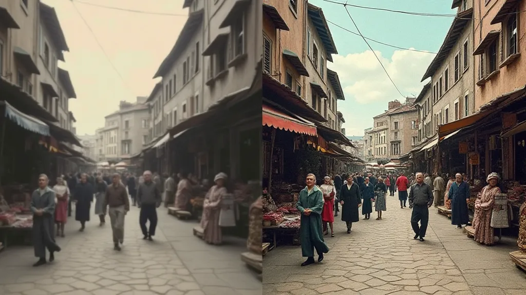
For example, a postcard depicting a flower garden might appear primarily in shades of gray in its original form. But knowing that roses were a popular flower, and that nurseries often showcased vibrant blooms, we can introduce hints of pink, red, and yellow. A shop front might appear as a flat gray, but research into the era's signage might reveal it was painted a bright turquoise or a deep crimson. This isn't about inventing colors; it's about *recovering* them, gently restoring a more accurate representation of what the scene would have likely appeared.
The key is subtlety. Overly saturated colors can look jarring and inaccurate. Our goal isn't to create a hyper-realistic digital painting, but to add depth, richness, and a sense of immediacy to the original image. We strive to create an illusion of color that feels authentic to the era, respecting the photographic style and the original composition.
More Than Just Restoration: A Celebration of Craftsmanship
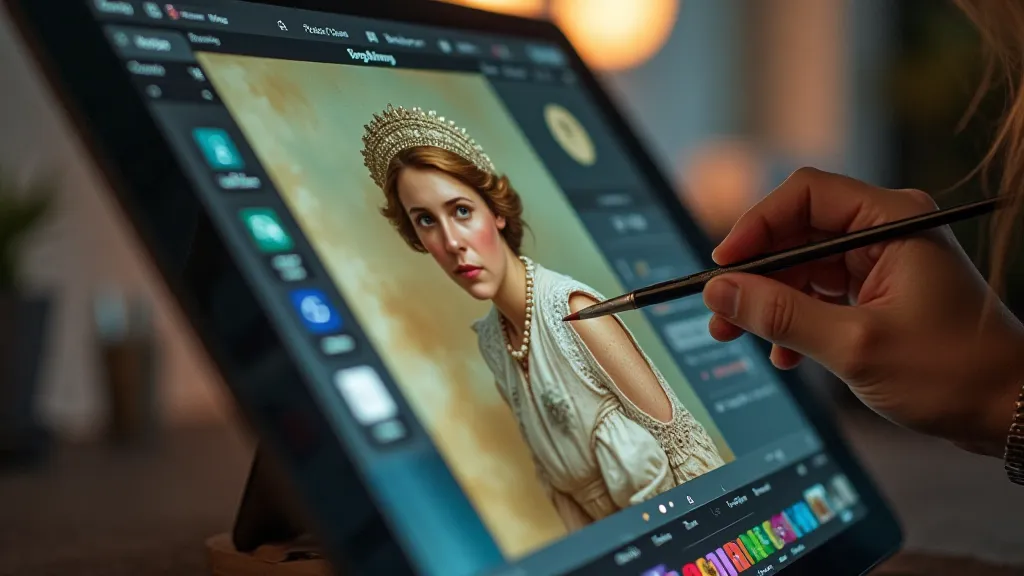
At The Antique Postcard Colorization Studio, we see our work as more than just digital photo restoration. It’s a form of artistic interpretation, a celebration of craftsmanship, and a way to connect with the past on a deeper level. It requires a delicate understanding of color theory, a keen eye for detail, and a deep respect for the original photograph. We use a variety of digital painting techniques, from subtle color washes to carefully rendered details, to achieve the desired effect.
Consider the work that went into the original photograph itself. The photographer had to meticulously compose the scene, choose the right lighting, and carefully operate the camera and developing process. The postcard printer had to produce a high-quality image on fragile paper. Our colorization process aims to honor that effort, to enhance the beauty and historical significance of the original artifact.
The Collector's Perspective: Beyond the Nostalgia
For collectors, these colorized postcards offer a unique opportunity to experience history in a new way. They can appreciate the details they might have missed in the faded black and white images. They can gain a better understanding of the era and the people who lived through it. They can simply enjoy the beauty of the restored image, brought to life with vibrant color.
Furthermore, colorized postcards can be valuable conversation starters, sparking interest in history and encouraging further research. They can be used in educational settings to illustrate historical contexts and to engage students in a more interactive learning experience. They can simply be a beautiful and intriguing addition to any collection.
Preserving the Past, Illuminating the Present
The Antique Postcard Colorization Studio is dedicated to preserving the past and illuminating the present. We believe that these fragile artifacts hold valuable stories, and we are committed to bringing those stories to life in a way that is both respectful and engaging. It’s about more than just adding color; it’s about revealing the true tones of a bygone era, understanding the stories held within, and celebrating the artistry and craftsmanship that created them. The sepia veil may be a consequence of time, but it doesn't have to be the final word.