The Cartographer of Hues: Reconstructing a Lost Palette from Fragmented Archives
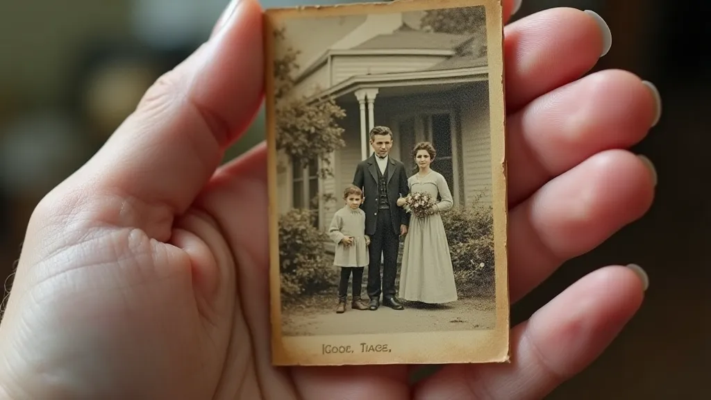
There's a particular melancholy that clings to antique postcards. They are whispers from a vanished world, frozen moments of lives lived differently, landscapes altered by time and progress. Their black and white imagery, while evocative in its own right, feels incomplete, a story told in shades of gray. My work, at The Antique Postcard Colorization Studio, isn't simply about adding color; it's about becoming a cartographer of hues, attempting to reconstruct a lost palette from fragmented archives, bringing those silent narratives back to vibrant life.
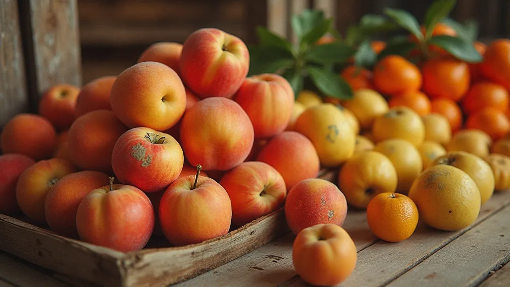
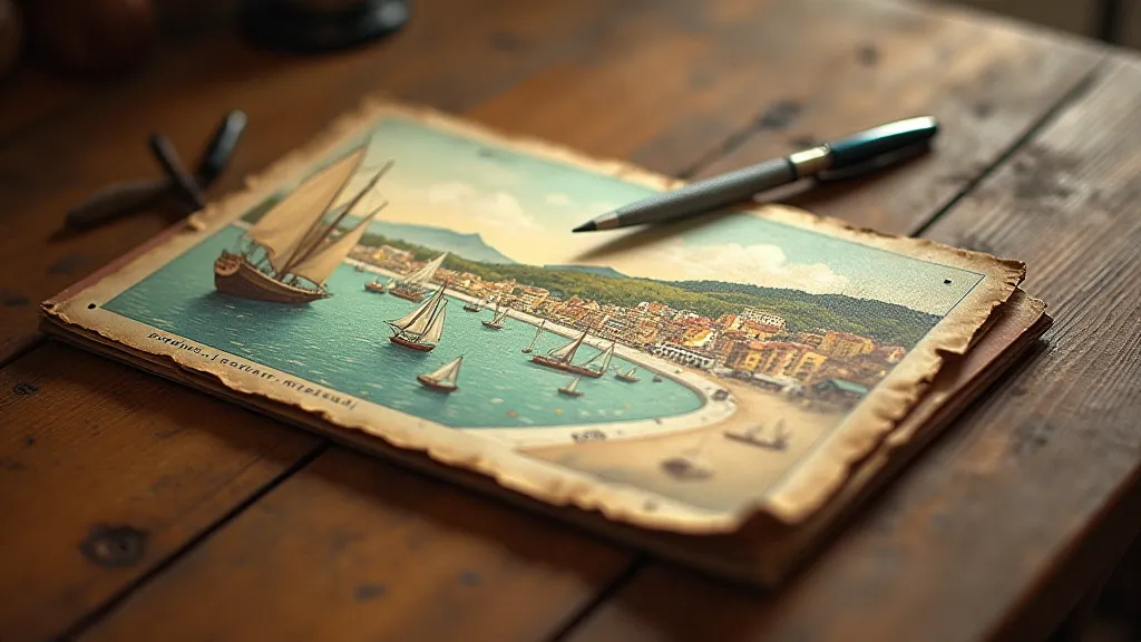
My fascination began with my grandfather, a collector of antique postcards. His collection was a sprawling testament to early 20th-century America - bustling cityscapes, serene rural scenes, portraits of strangers whose names and stories were lost to the relentless tide of years. As a child, I’d spend hours sifting through those cards, mesmerized by the grainy textures and the stark contrast. I remember one, in particular, a picture of a bustling fruit market in Philadelphia around 1910. It felt… drained. The vibrancy of ripe peaches, the gleam of polished apples, the rich reds and golds of stacked produce – all lost in a sea of black and white. That’s when the desire to restore a measure of that lost color began to stir within me.
The Challenge of Inference: Beyond Simple Colorization
The process isn’t as simple as choosing pleasing colors. It’s a process of deduction, requiring historical research and a deep understanding of color theory. Unlike restoring a damaged photograph, where you might be able to compare it to a known color reference, antique postcards often lack that advantage. We’re working with ghosts – shadows of a reality we can only partially understand. A direct, "this is definitely purple" answer rarely exists.
The first step is always meticulous research. What was the region like at the time? What were the dominant crops? What types of clothing were common? What dyes and pigments were available? This isn't just about picking a shade of blue for the sky; it's about understanding the environmental context that influenced the colors present in the scene. For instance, the availability of certain dyes significantly impacted the clothing colors people wore. Synthetic dyes, becoming increasingly available in the early 1900s, allowed for brighter, more varied hues than previously possible.
The Language of Clothing: Clues in the Fabric
Clothing provides a particularly valuable source of information. Uniforms, often standardized, offer reliable color references. Advertisements and fashion plates from the era can also offer insights into popular styles and color choices. However, it's crucial to consider social class. A wealthy family would likely have access to more vibrant and expensive dyes than a working-class family. A faded advertisement showcasing a popular dress, for example, might suggest that many women owned similar garments, but the original colors might have been more intense than what the aged print reveals.
The challenge lies in acknowledging the inherent subjectivity. There is rarely a definitive "correct" answer. My goal isn't to create an exact replica of the original colors (if those could even be reliably determined), but rather to create a believable and evocative representation that enhances the postcard’s historical context and emotional impact. It’s about breathing life back into a moment, not recreating it with scientific precision.
The Subtle Art of Shadow and Light
Beyond simply choosing colors, understanding how light interacts with those colors is essential. The harsh glare of sunlight, the diffused glow of an overcast sky – these factors dramatically influence how colors appear. Shadows aren't simply black; they're complex mixtures of color. A deep understanding of color theory – complementary colors, analogous colors, saturation, and value – allows for a more nuanced and realistic representation of the scene.
Digital photo restoration software provides a powerful toolkit for this process. Layer masks, blending modes, and adjustment layers allow for incredibly precise control over color adjustments. However, the software is only a tool. The artistry lies in knowing how to wield it effectively, in making choices that are informed by historical knowledge and aesthetic sensibility.
The most satisfying part of the process isn’s the technical skill, but the moment when a faded image begins to regain its vitality. Seeing the subtle hues of a woman’s shawl, the rich tones of a brick building, the lush greenery of a park – it’s a small victory against the relentless march of time.
The Collector's Perspective: Preservation and Appreciation
My work isn't meant to replace the inherent beauty of the black and white originals. Rather, it's an alternative form of appreciation, a way to experience these historical glimpses in a new light. Some collectors prefer the starkness of the black and white image; others appreciate the added dimension of color. Both perspectives are valid.
The fragility of these postcards is also a constant consideration. Handling them minimally, storing them properly, and using non-abrasive cleaning techniques are crucial for preserving their integrity. My colorization process is entirely digital, ensuring that the original postcard remains untouched. The colorized version is a separate digital file, allowing collectors to enjoy the vibrancy of color without compromising the authenticity of the original.
A Testament to a Lost Era
The Antique Postcard Colorization Studio is more than just a restoration service; it's a labor of love, a way to honor the people and places captured in these fragile documents. Each card is a window into a lost era, a testament to the ingenuity, the resilience, and the beauty of a bygone world. Becoming the cartographer of hues allows me to add a layer of understanding and appreciation, bringing these lost moments back to life, one color at a time.