Chromatic Echoes: When Black and White Whispers Become Vibrant Narratives
There's a particular magic in holding an antique postcard. The thin, often brittle cardstock, the faded ink of a handwritten message, the quiet echo of a moment captured a century or more ago. These aren’t just images; they’re windows to lives lived, to landscapes vanished, to a time that feels both distant and intimately familiar. But when those images are rendered in stark black and white, something is lost – a layer of emotional resonance, a vital thread in the narrative. That’s where postcard colorization comes in, a delicate art form that breathes new life into these treasured fragments of the past.
My own fascination with postcard colorization began, as many things do, with a family connection. My grandmother, a meticulous collector of antique postcards, possessed a small album filled with scenes of a long-gone seaside resort – her childhood summers frozen in monochrome. She’s gone now, but I remember her explaining how the cards evoked memories of laughter, the smell of saltwater taffy, and the vibrant hues of the summer dresses worn by her aunts. Those colors existed only in her memory, but they were undeniable. It sparked in me a desire not just to preserve these images but to somehow bring those lost memories, those personal histories, back to life.
The Psychology of Color: Beyond Visuals
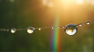
It's easy to view colorization as a purely technical process - a skillful application of digital tools. However, the true power lies in its psychological impact. Color profoundly influences our perception and emotions. Black and white, while inherently beautiful in its simplicity and graphic clarity, evokes a sense of distance, objectivity, and sometimes even melancholy. It's a visual representation of the passage of time, of a world viewed through a historical lens. Adding color doesn’t just *show* us a scene; it invites us to experience it.
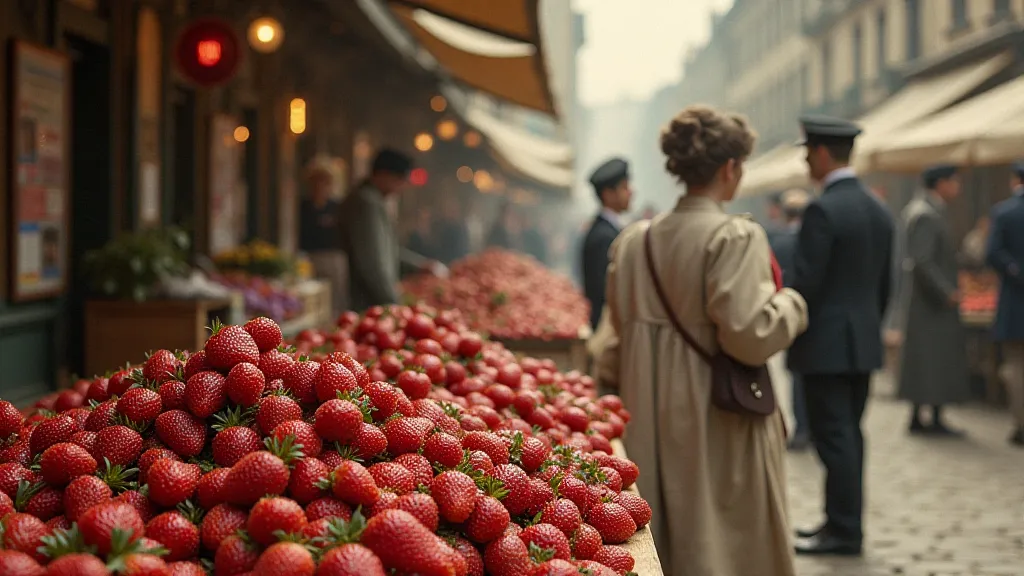
Consider a black and white image of a bustling marketplace in 1910. It’s a snapshot of a moment, a document of a bygone era. Now, imagine that same scene rendered in color – the ruby red of a vendor's cherries, the sunflower yellow of a child’s dress, the earthy browns of the cobblestones. Suddenly, the scene isn’t just observed; it's inhabited. We feel the warmth of the sun, the energy of the crowd, the vibrancy of daily life. This shift in perception is incredibly powerful, drawing us closer to the individuals and the events depicted.
The Art of Interpretation: Historical Accuracy and Artistic License
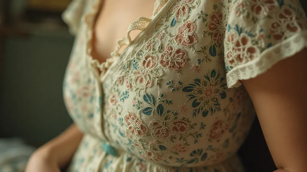
Postcard colorization isn’t simply about slapping on any color that feels “right.” It demands a careful balance between historical accuracy and artistic interpretation. A responsible colorizer delves into the period's fashion, architecture, and popular goods to ensure colors are believable and authentic. Research is key. Examining period clothing catalogs, analyzing advertisements, and studying photographs of the era provides invaluable clues. A vibrant pink dress in a 1920s photograph, for instance, might be a lovely artistic choice, but it’s crucial to ensure that shade of pink was actually available and fashionable at the time.
However, rigid adherence to absolute accuracy can sometimes stifle the creative process and flatten the emotional impact. There's room for artistic license, for subtly enhancing the colors to create a particular mood or atmosphere. A slightly more saturated red on a flower bed might evoke a sense of vitality and joy, even if the original photograph’s tonal range was more muted. The goal is to create an image that is both believable and emotionally resonant, an image that honors the past while simultaneously engaging the present.
Craftsmanship and the Digital Palette
The techniques involved in postcard colorization have evolved dramatically with the advent of digital technology. Early attempts often resulted in images that appeared artificial and garish, betraying the inherent beauty of the original photograph. Today, advanced software and sophisticated algorithms allow for incredibly nuanced and realistic results. Layering techniques, meticulous attention to light and shadow, and a deep understanding of color theory are essential for achieving a believable outcome.
I personally favor a non-destructive workflow, employing multiple layers and masks to allow for adjustments and refinements at every stage of the process. This approach allows me to experiment with different color palettes and lighting conditions without permanently altering the original black and white image. The digital tools are merely instruments; the artist’s eye and understanding of color remain the most vital components.
Beyond Restoration: A Bridge to the Past
Postcard colorization is more than just digital photo restoration; it’s a form of historical storytelling. It breathes new life into these fragile fragments of the past, allowing us to connect with individuals and events in a more intimate and meaningful way. It’s a bridge between generations, a way to share the memories of those who came before us. Consider the implications: these postcards often depict everyday moments – a family outing, a town parade, a quiet street scene. They offer glimpses into lives that might otherwise be lost to history.
The value of these images extends beyond their aesthetic appeal. They are historical documents, providing invaluable insights into the fashion, architecture, and culture of the past. By carefully preserving and colorizing these postcards, we are not only creating beautiful works of art, but also safeguarding a valuable piece of our collective heritage.
A Continuing Journey
The journey of postcard colorization is a continuous exploration - an ongoing process of learning, experimentation, and refinement. It's a privilege to be able to breathe new life into these fragile fragments of the past, to share their stories with a wider audience. And perhaps, in doing so, to inspire a deeper appreciation for the beauty and richness of our collective history.