The Painter's Reverie: Mastering Color Harmony in Historical Reconstruction
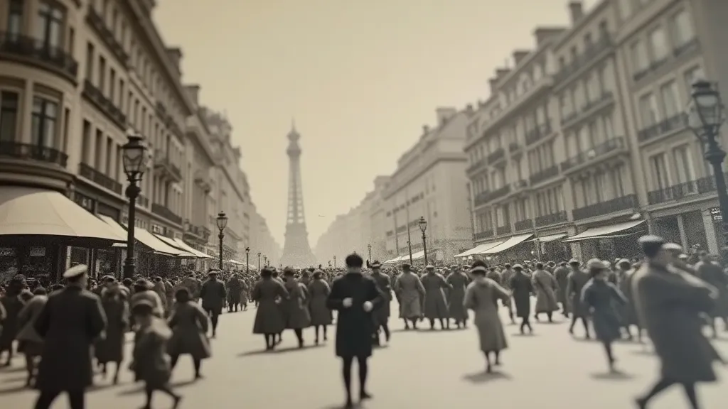
There's a peculiar magic in holding an antique postcard. The thin, brittle card stock, the faded ink, the glimpse into a vanished world… it whispers stories. For me, the most compelling whisper is the promise of color – of breathing life back into the monochrome echoes of the past. My studio, "The Antique Postcard Colorization Studio," is dedicated to this pursuit, a quiet corner where history meets artistry. But it’s more than just ‘coloring in’ a picture; it’s a reverie, a deeply considered act of historical reconstruction informed by color harmony principles. This isn't simply photo manipulation; it’s an act of empathetic imagining.
My journey began, unexpectedly, with my grandfather’s collection. He wasn't a postcard collector in the traditional sense; they were remnants of his travels, tangible memories of a life lived across continents. As a child, I’d pore over them, imagining the vibrant hues of the bustling markets in Cairo, the deep blues of the Mediterranean sea, the emerald green of the Italian countryside. The black and white images sparked a thirst for those lost colors, a longing to see what he had witnessed. I began sketching, attempting to add my own interpretations, quickly realizing how challenging and nuanced the process was.
The common misconception is that colorizing old photos is purely about artistic license. While there's an element of creative interpretation, true historical reconstruction demands a rigorous understanding of color theory and historical context. Simply choosing "pretty" colors is an insult to the original scene and the people who lived in it. It’s about being a detective, piecing together clues from a variety of sources – clothing styles, advertisements, contemporary artwork, and even the types of buildings that would have been prevalent in a specific era and location. What was considered a "fashionable" color in 1910 might be utterly jarring when applied to a 1950s scene. The research is often as rewarding as the creation itself.
The Foundation: Color Harmony and Historical Context
Color harmony isn’t just about what “looks good”; it's about creating a visual balance that evokes a specific feeling. Complementary colors create vibrancy and contrast, analogous colors offer a sense of tranquility and cohesion, and triadic colors offer a dynamic and balanced feel. However, these principles must be tempered by the historical palette available. For example, the brilliant, synthetic dyes we enjoy today weren't readily available in the early 1900s. Many colors were derived from natural pigments, resulting in more muted and earthy tones. Understanding which dyes were common, and how they were used, is crucial to creating a believable reconstruction.
Take, for example, a postcard from a mining town in Pennsylvania. The coal dust permeated everything – the buildings, the clothes, even the air. A vibrant, saturated palette would be entirely anachronistic. Instead, a range of grays, browns, and muted greens – reflecting the environment – would be far more authentic. Similarly, the clothing of a wealthy merchant in Vienna would differ drastically from the attire of a working-class family in London. These are the subtleties that separate a passable colorization from a truly respectful restoration.
The Digital Studio: Tools and Techniques
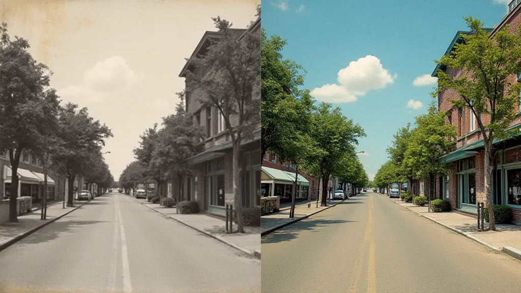
While the understanding of color harmony is paramount, the digital tools are essential for execution. I primarily use Adobe Photoshop, employing a non-destructive workflow – meaning I can adjust every color decision at any point in the process. The initial steps involve careful dust and scratch removal, followed by tonal correction to enhance the underlying details. Then, the real work begins: building up the color layers. I use a combination of blending modes, masking, and color correction tools to create a realistic and nuanced effect.
It’s a painstaking process, often taking many hours to colorize a single postcard. Each element – the sky, the buildings, the people – receives individual attention. I frequently consult reference materials – photographs, paintings, and even historical advertisements – to ensure accuracy. The goal isn't to create a hyper-realistic image, but rather to evoke the feeling of the original scene in color. Sometimes, a subtle shift in hue or a delicate adjustment to the saturation can make all the difference.
The Emotional Resonance: Beyond the Technical
For me, the most rewarding aspect of postcard colorization isn’t the technical skill involved, but the emotional connection it fosters. Seeing a previously monochrome image bloom with color can be a profoundly moving experience, both for myself and for the viewers. It’s a chance to reconnect with the past, to see the world through the eyes of those who came before us. These aren’t just pictures; they’re windows into lives lived, stories waiting to be retold.
One particularly memorable project involved colorizing a postcard of my grandfather's childhood home in Egypt. Seeing the vibrant colors of the market square, the bustling activity of the people, the warmth of the Egyptian sun... it brought him to tears. It wasn’t just about seeing a picture in color; it was about reliving a cherished memory, a connection to his heritage. That, for me, is the true purpose of this craft.
Preserving a Legacy: A Collector’s Perspective
The demand for colorized antique postcards is growing, not just among collectors but also among family members eager to see their ancestors brought to life. Collecting antique postcards, regardless of whether they are colorized or original, is a fascinating hobby. It's a tangible link to the past, a chance to own a piece of history. When collecting, look for postcards in good condition – free from major damage or excessive wear. Also, research the postcard’s origins – the publisher, the artist, and the location. These details can significantly increase its value and historical significance.
Ultimately, the Antique Postcard Colorization Studio isn’t just about restoring color; it’s about preserving memories, celebrating heritage, and sharing the beauty of the past. It's a painter's reverie, a continuous exploration of color, history, and the enduring power of a single image.
