The Palette of Memory: How Color Choice Shapes Narrative and Emotion
There’s a profound quiet that descends when you hold an antique postcard. It's not merely the silence of the paper itself, but a stillness born from decades, sometimes centuries, of frozen time. The black and white image, a snapshot of a bygone era, whispers of lives lived, events witnessed, and stories untold. As a colorization artist, my role isn’t to simply add color; it’s to unlock those untold stories, to breathe life back into the echoes of the past, and to subtly guide the viewer’s emotional response through the careful application of color.
I began colorizing antique postcards almost by accident. I was a digital artist, fascinated by historical photography, and stumbled upon a faded image of a bustling marketplace from the early 1900s. The grays were lovely, evocative even, but something felt missing. I yearned to see it as it *felt* to those who lived it – the vibrancy of the fabrics, the warmth of the sunlight, the richness of the produce. My first attempts were, admittedly, disastrous. Colors were jarring, unrealistic, and ultimately, distracting. But through trial and error, through countless hours of research and experimentation, I began to understand that color wasn’t just about visual accuracy; it was about narrative.
The crucial first step in any postcard colorization project isn’t about picking up a stylus. It’s about research. You must become a historian, a social scientist, an observer of human behavior. What year was the postcard taken? What was the region like? What were the dominant industries, the popular fashions, the prevalent attitudes? These aren't just academic exercises; they are essential tools for making informed color choices that respect the historical context.
The Language of Color: A Historical Perspective
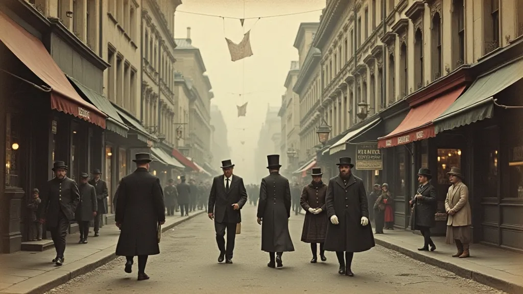
Consider the early 20th century. Colors were readily available, but their use was often dictated by social class and available dyes. Bright, saturated colors like crimson and emerald were expensive and associated with the wealthy. More subdued tones—ochres, browns, and grays—were common among the working class. A red dress on a factory worker would be an anomaly; it would signal an error, a misrepresentation of reality. Conversely, a somber gray suit on a debutante would feel equally out of place.
During the Victorian era, specific colors were imbued with symbolic meanings. Mourning dictated the appropriate attire and palette – deep blacks, purples, and grays. Romanticism embraced softer hues – pinks, lavenders, and greens – evoking feelings of nostalgia and longing. These nuances are vital in creating an authentic portrayal. I once worked on a postcard depicting a group of children playing in a seaside town. My initial instinct was to use bright, cheerful yellows and oranges. However, after researching clothing styles of the time, I realized that children’s clothing was often quite muted, practical rather than flamboyant. Switching to gentler, earthier tones immediately enhanced the image’s historical accuracy and emotional resonance.
Evoking Emotion: Beyond Visual Accuracy
While historical accuracy is crucial, colorization isn't simply an exercise in reproduction. It’s an artistic interpretation. This is where the real magic – and the potential for missteps – lies. Color can be used to subtly manipulate the viewer's emotional response. A touch of warm yellow can evoke feelings of optimism and joy. A hint of blue can convey a sense of melancholy or tranquility. A splash of crimson can signify danger or passion.
Take, for example, a postcard depicting a soldier returning home from war. A straightforward, purely accurate colorization might simply replicate the drab uniforms and muddy landscape. However, introducing a subtle golden hue to the sunlight could suggest hope and the promise of a brighter future. A soft peach tone on the faces of the waiting family could convey overwhelming relief and joy. These are not mere cosmetic changes; they are deliberate choices that shape the narrative and deepen the emotional impact.
The Importance of Subtlety and Contrast
One of the biggest pitfalls for novice colorizers is overdoing it. Saturated, artificial colors can shatter the illusion and detract from the image’s inherent charm. The most effective colorizations are often the ones where the additions are subtle, almost imperceptible. They blend seamlessly with the original grayscale, enhancing rather than overwhelming it.
Contrast is also a powerful tool. Consider the stark contrast between the black and white of the original image and the introduction of a single, saturated color. This can draw the viewer's eye to a specific detail, highlighting its significance. A single, vibrant red rose in a field of gray could symbolize love, hope, or even defiance.
Craftsmanship and the Human Touch
The digital tools we use are constantly evolving, but the essence of postcard colorization remains deeply rooted in craftsmanship. It's a process that requires patience, attention to detail, and a deep appreciation for the human touch. I often find myself spending hours meticulously adjusting the hue, saturation, and brightness of individual elements – a single strand of hair, a patch of fabric, a subtle expression on a face.
It's also important to remember that antique postcards were not always perfect. They were often damaged, faded, or poorly printed. As a colorizer, I have the opportunity – and the responsibility – to restore these imperfections, to subtly enhance the image’s quality without erasing its history. This isn't about creating a flawless replica; it's about bringing the past to life in a way that is both respectful and engaging.
Beyond the Technical: A Connection to the Past
For me, postcard colorization is more than just a technical skill; it’s a deeply personal journey. It’s a way of connecting with the past, of imagining what it was like to live in another time and place. Each postcard tells a story, and as a colorizer, I have the privilege of bringing that story to life. It’s a humbling and rewarding experience, one that I hope will continue to inspire and engage audiences for years to come.